Sina Auto Repair Dubai
Case study no . 2


Project Overview
Sina Auto Repair is a Dubai-based auto repair and tyre shop. Their old website lacked clarity and failed to showcase their unique services, leading to a confusing customer experience. I redesigned the site to highlight service packages, mobile repair options, and trust-building features, creating a modern and user-friendly platform.
Project type: UX/UI, Branding
Case study timing: 4 weeks
Role: UX/UI Designer, Researcher
Tools: Wix, Adobe Illustrator, Figma
THE DESIGN BRIEF
PROBLEM
The business owner shared that their existing website was not generating results. Customers rarely visited the site, and no one was calling to request services. Negative feedback also emerged around the site’s confusing navigation and lack of helpful customer support. The outdated design and unclear structure failed to highlight key services or build trust, leaving users frustrated and disengaged.
PROJECT GOAL
The redesign aimed to transform the website into a user-friendly, customer-focused platform. The primary goals were to:
-
Improve usability and navigation so customers could quickly find what they needed.
-
Highlight high-demand services that customers most frequently asked for.
-
Enhance the shop section to better showcase tyres and batteries.
-
Introduce package-based services that made it easier for customers to understand options and pricing.
-
Modernize the design to build trust and encourage users to contact the business.
Website Glow-Up

-
Services offered by the business are not clearly displayed.
-
The main menu includes items such as Tyres, Wheels, Batteries, which link only to blog content rather than related services.
-
Services are clearly highlighted and immediately visible at first glance.
-
Users are informed about current offers in a direct and accessible way.
-
The menu is streamlined with relevant options, clearly indicating the services provided.

-
Service titles are difficult to read due to poor color contrast.
-
It is unclear what specific support or sub-services each service provides.

-
The text is now easy to read thanks to better color contrast.
-
Each service card includes an icon and clearly lists the related sub-services offered.

-
Users had to scroll all the way to the bottom of the homepage to request a quote.

-
Key actions like (Booking a service, Requesting a quote, and Shopping) are visible right away on the homepage.

-
Users can now choose from service packages at a discounted price, making it easier and more affordable to book multiple services.

-
A shopping feature was added, allowing users to buy tyres directly online. Special limited-time discounts make the offers more attractive.
Empathetic Approach
In this section
-
Competitive Analysis
-
User Interviews
-
User Persona
-
Research Key findings
User Interviews
To understand customer expectations and pain points when using auto repair services in Dubai, focusing on how they search for services, request help, and what features they value most in a repair shop’s website.
Age: 34, Occupation: IT technician
-
Drives daily from Sharjah to Dubai.
-
Prefers quick, reliable roadside assistance when tires fail.
-
Relies heavily on his phone for booking and calling.
This participant said they usually call directly when they have a flat tire; they don’t want to waste time scrolling through a website.
Competitive Analysis
To guide the redesign, I compared Sina Auto Repair with three competitors in Dubai. The analysis focused on key features customers expect, such as online booking, mobile services, service packages, transparent pricing, and shopping options. This showed where Sina was already strong and where adding new features could create an advantage.

User Persona
I created the user persona by combining insights from the competitive analysis and simulated user interviews. This persona represents the key needs, goals, and frustrations of Sina Auto Repair’s target customers, such as quick roadside support, transparent pricing, and easy booking options.
Throughout the project, the persona served as a reference point to guide design decisions and ensure the redesign addressed real user expectations. By continually referring back to this document, I was able to keep the design aligned with both user needs and the project goals.

Key Findings
From the research, I identified several key insights about user needs and expectations. These findings guided the redesign and shaped the features I prioritized in the next steps.
01.
Easy booking system: Ability to request services quickly, without scrolling/searching too much.
02.
Transparent pricing/estimates: Users want to know approximate costs upfront.
03.
Mobile services: Roadside assistance or mechanic on-site is highly valued.
04.
Service packages: Bundled offers are attractive for frequent drivers.
05.
Promotions/discounts: Limited-time offers encourage customers to buy.
Ideate
In this section
-
Site Map
-
Task Flow
-
Low-fidelity Wireframes
Site Map
The site map provided a clear overview of Sina Auto Repair’s website structure. It helped me understand how the main sections (Shop, Services, Contact, Cart, etc.) were organized and how users can access different features. Mapping out these connections allowed me to identify what information was available, how users might navigate, and where potential gaps in the site experience existed.

User Flow
The user flow built on the site map and persona by showing the actual steps a customer might take to complete a task, such as buying tyres or booking a service. This flow helped me visualize the decision points and possible paths users follow, ensuring the design supports their needs efficiently. By referencing the persona, I aligned the flow with real user behaviors, making it practical for guiding the prototype and testing stages.

Low-fi Wireframes
I started my low-fi wireframes in FigJam, focusing first on the desktop version. After making sure the structure and components worked well, I applied the design to Wix.


Final Design
Design Implementation & User Feedback
After applying the design in Wix, I conducted a small usability test with three of the interview participants. The feedback highlighted some key improvements:
-
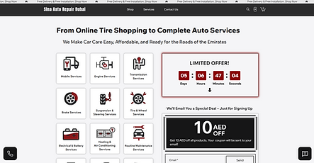
Users suggested adding special deals or service package offers directly on the homepage.
-
Despite having a booking button at the top, users still looked for it elsewhere, so I repositioned it for better visibility.
-
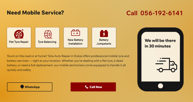
Since mobile service was an important feature, but not obvious enough, I designed a dedicated homepage section for it.
You can see the full version of the Sina Auto Repair website using this link: [https://www.sinaautorepairdubai.com/].
Offers & Booking Button


Mobile Service Section